ARTSLOPE
You are here:
Home
Design
Design
Latest
Oldest
Most Discussed
Latest stories
in
Art
,
Design
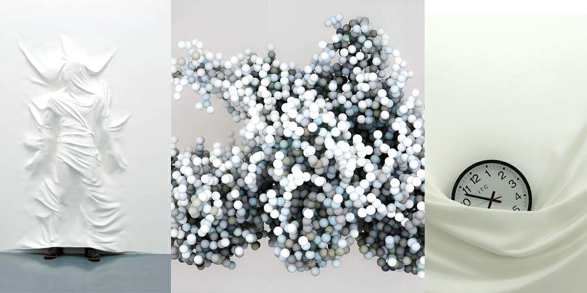
Daniel Arsham: “The Fall, the Ball, and the Wall”, brought by Oxycodone
Back to Top
Close
Search for:
Search